# Semantics
# Forms
form을 생성할 때, 다음과 같은 엘리먼트를 사용할 수 있습니다: <form>, <label>, <input>, <textarea>, and <button>
label 엘리먼트는 일반적으로 form 필드의 상단 또는 왼쪽에 배치됩니다:
<form action="/dataCollectionLocation" method="post" autocomplete="on">
  <div v-for="item in formItems" :key="item.id" class="form-item">
    <label :for="item.id">{{ item.label }}: </label>
    <input
      :type="item.type"
      :id="item.id"
      :name="item.id"
      v-model="item.value"
    />
  </div>
  <button type="submit">Submit</button>
</form>
2
3
4
5
6
7
8
9
10
11
12
See the Pen Simple Form by Maria (@mlama007) on CodePen.
form 엘리먼트에 autocomplete='on'을 포함할 수 있으며, form의 모든 input에 적용되는 방법에 유의하십시오. 각 input에 서로 다른 자동 완성 속성 값 (opens new window)을 설정할 수도 있습니다.
# Labels
모든 form 컨트롤의 목적을 설명하는 label을 제공해야 합니다. for 와 id 를 연결하여 제공:
<label for="name">Name</label>
<input type="text" name="name" id="name" v-model="name" />
2
See the Pen Form Label by Maria (@mlama007) on CodePen.
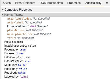
크롬 개발자 도구에서 이 엘리먼트를 검사하고 Elements 탭 내부의 접근성 탭을 열면, input이 label에서 이름을 가져오는 방법을 볼 수 있습니다.
Warning:
이와 같이 input 필드를 감싸는 label을 보았을 수도 있지만:
<label>
  Name:
  <input type="text" name="name" id="name" v-model="name">
</label>
2
3
4
일치하는 id로 label을 명시적으로 설정하는 것이 보조 기술에 의해 더 잘 지원됩니다.
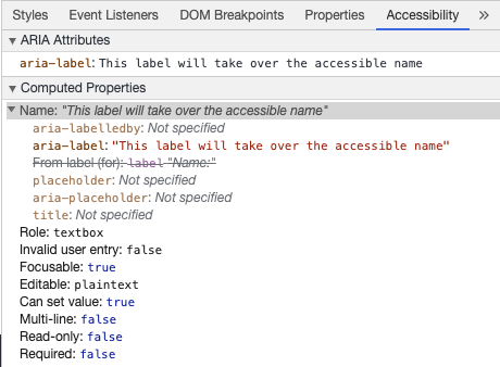
# aria-label
aria-label (opens new window) 을 통해서 보조 기술이 접근 가능한 이름을 input 요소에게 줄 수 있습니다.
<label for="name">Name</label>
<input
  type="text"
  name="name"
  id="name"
  v-model="name"
  :aria-label="nameLabel"
/>
2
3
4
5
6
7
8
See the Pen Form ARIA label by Maria (@mlama007) on CodePen.
크롬 개발자 도구에서 이 엘리먼트를 검사하여 aria-label이 어떻게 변경되었는지 확인해보세요:
# aria-labelledby
aria-labelledby를 사용하는 것은 aria-label과 유사하며, 화면에 label 텍스트가 보이는 경우 사용된다는 것을 예상합니다. id로 다른 엘리먼트와 쌍을 이루며, 여러 id를 연결할 수 있습니다:
<form
  class="demo"
  action="/dataCollectionLocation"
  method="post"
  autocomplete="on"
>
  <h1 id="billing">Billing</h1>
  <div class="form-item">
    <label for="name">Name:</label>
    <input
      type="text"
      name="name"
      id="name"
      v-model="name"
      aria-labelledby="billing name"
    />
  </div>
  <button type="submit">Submit</button>
</form>
2
3
4
5
6
7
8
9
10
11
12
13
14
15
16
17
18
19
See the Pen Form ARIA labelledby by Maria (@mlama007) on CodePen.
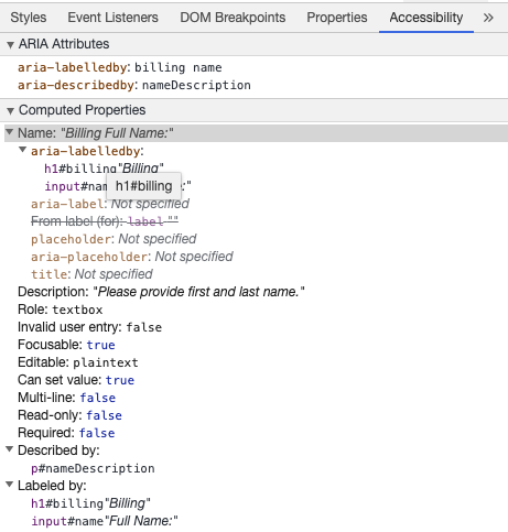
# aria-describedby
aria-describedby (opens new window)는 aria-labelledby가 사용자에게 필요할 수 있는 추가 정보가 포함된 설명을 제공하는 것과 동일한 방식으로 사용됩니다. 입력 기준을 설명하는 데 사용할 수 있습니다.
<form
  class="demo"
  action="/dataCollectionLocation"
  method="post"
  autocomplete="on"
>
  <h1 id="billing">Billing</h1>
  <div class="form-item">
    <label for="name">Full Name:</label>
    <input
      type="text"
      name="name"
      id="name"
      v-model="name"
      aria-labelledby="billing name"
      aria-describedby="nameDescription"
    />
    <p id="nameDescription">Please provide first and last name.</p>
  </div>
  <button type="submit">Submit</button>
</form>
2
3
4
5
6
7
8
9
10
11
12
13
14
15
16
17
18
19
20
21
See the Pen Form ARIA describedby by Maria (@mlama007) on CodePen.
크롬 개발자 도구 검사를 통해서 해당 설명을 확인할 수 있습니다:
# Placeholder
placeholder는 많은 사용자에게 혼란을 줄 수 있으므로 사용을 자제해주세요.
placeholder의 문제 중 하나는 기본적인 색 대비 기준 (opens new window)을 충족하지 못한다는 것입니다. 색 대비를 수정하면 placehoder가 input 필드에 미리 입력된 데이터처럼 보이게 됩니다. 다음 예제를 살펴 보면, 색 대비 기준을 충족하는 Last Name placeholder는 미리 입력된 데이터처럼 보이는 것을 확인할 수 있습니다.
See the Pen Form Placeholder by Maria (@mlama007) on CodePen.
사용자가 입력 외부에서 form을 작성하는데 필요한 모든 정보를 제공하는 것이 가장 좋은 방법입니다.
# Instructions
input 필드에 대한 instruction을 추가할 때는, input에 올바르게 연결해야 합니다. 추가 instruction을 제공하고 aria-labelledby (opens new window) 내에 여러 ID를 바인딩할 수 있습니다. 이를 통해 보다 유연한 설계를 할 수 있습니다.
<fieldset>
  <legend>Using aria-labelledby</legend>
  <label id="date-label" for="date">Current Date:</label>
  <input
    type="date"
    name="date"
    id="date"
    aria-labelledby="date-label date-instructions"
  />
  <p id="date-instructions">MM/DD/YYYY</p>
</fieldset>
2
3
4
5
6
7
8
9
10
11
또는 aria-describedby (opens new window)를 사용하여 input에 instruction을 첨부할 수 있습니다.
<fieldset>
  <legend>Using aria-describedby</legend>
  <label id="dob" for="dob">Date of Birth:</label>
  <input type="date" name="dob" id="dob" aria-describedby="dob-instructions" />
  <p id="dob-instructions">MM/DD/YYYY</p>
</fieldset>
2
3
4
5
6
See the Pen Form Instructions by Maria (@mlama007) on CodePen.
# 내용 감추기(Hiding Content)
일반적으로 input에 접근 가능한 이름이 있더라도 label을 시각적으로 숨기지 않는 것이 좋습니다. 그러나 input의 기능을 주변 컨텐츠로 이해할 수 있다면, 시각적으로 레이블을 숨길 수 있습니다.
검색 영역을 확인해보세요:
<form role="search">
  <label for="search" class="hidden-visually">Search: </label>
  <input type="text" name="search" id="search" v-model="search" />
  <button type="submit">Search</button>
</form>
2
3
4
5
search 버튼은 화면을 보는 사용자가 input 영역의 목적을 확인하는 데 도움이 되기 때문에 시각적으로 레이블을 숨길 수 있습니다.
CSS를 사용하여 엘리먼트를 시각적으로 숨기지만, 보조 기술에 사용할 수 있도록 유지할 수 있습니다.
.hidden-visually {
  position: absolute;
  overflow: hidden;
  white-space: nowrap;
  margin: 0;
  padding: 0;
  height: 1px;
  width: 1px;
  clip: rect(0 0 0 0);
  clip-path: inset(100%);
}
2
3
4
5
6
7
8
9
10
11
See the Pen Form Search by Maria (@mlama007) on CodePen.
# aria-hidden="true"
aria-hidden="true"를 추가하면 보조 기술에서 요소가 숨겨지지만, 화면을 보는 사용자는 사용할 수 있도록 남겨집니다. 포커스 가능한 요소, 단순한 장식, 중복 또는 오프스크린(offscreen) 컨텐츠에 사용하지 마십시오.
<p>This is not hidden from screen readers.</p>
<p aria-hidden="true">This is hidden from screen readers.</p>
2
# Buttons
form 내에서 button을 사용할 때, form submit을 방지하기 위해 type을 설정해야 합니다. input을 사용하여 버튼을 만들 수도 있습니다:
<form action="/dataCollectionLocation" method="post" autocomplete="on">
  <!-- Buttons -->
  <button type="button">Cancel</button>
  <button type="submit">Submit</button>

  <!-- Input buttons -->
  <input type="button" value="Cancel" />
  <input type="submit" value="Submit" />
</form>
2
3
4
5
6
7
8
9
See the Pen Form Buttons by Maria (@mlama007) on CodePen.
# 기능적인 이미지(Functional Images)
이 기법을 사용해 기능적인 이미지를 만들 수 있습니다.
입력 영역(Input fields)
- 이 이미지는 form에서 submit타입의 button 역할을 수행합니다.
<form role="search">
  <label for="search" class="hidden-visually">Search: </label>
  <input type="text" name="search" id="search" v-model="search" />
  <input
    type="image"
    class="btnImg"
    src="https://img.icons8.com/search"
    alt="Search"
  />
</form>
1
2
3
4
5
6
7
8
9
10아이콘(Icons)
<form role="search">
  <label for="searchIcon" class="hidden-visually">Search: </label>
  <input type="text" name="searchIcon" id="searchIcon" v-model="searchIcon" />
  <button type="submit">
    <i class="fas fa-search" aria-hidden="true"></i>
    <span class="hidden-visually">Search</span>
  </button>
</form>
2
3
4
5
6
7
8
See the Pen Functional Images by Maria (@mlama007) on CodePen.